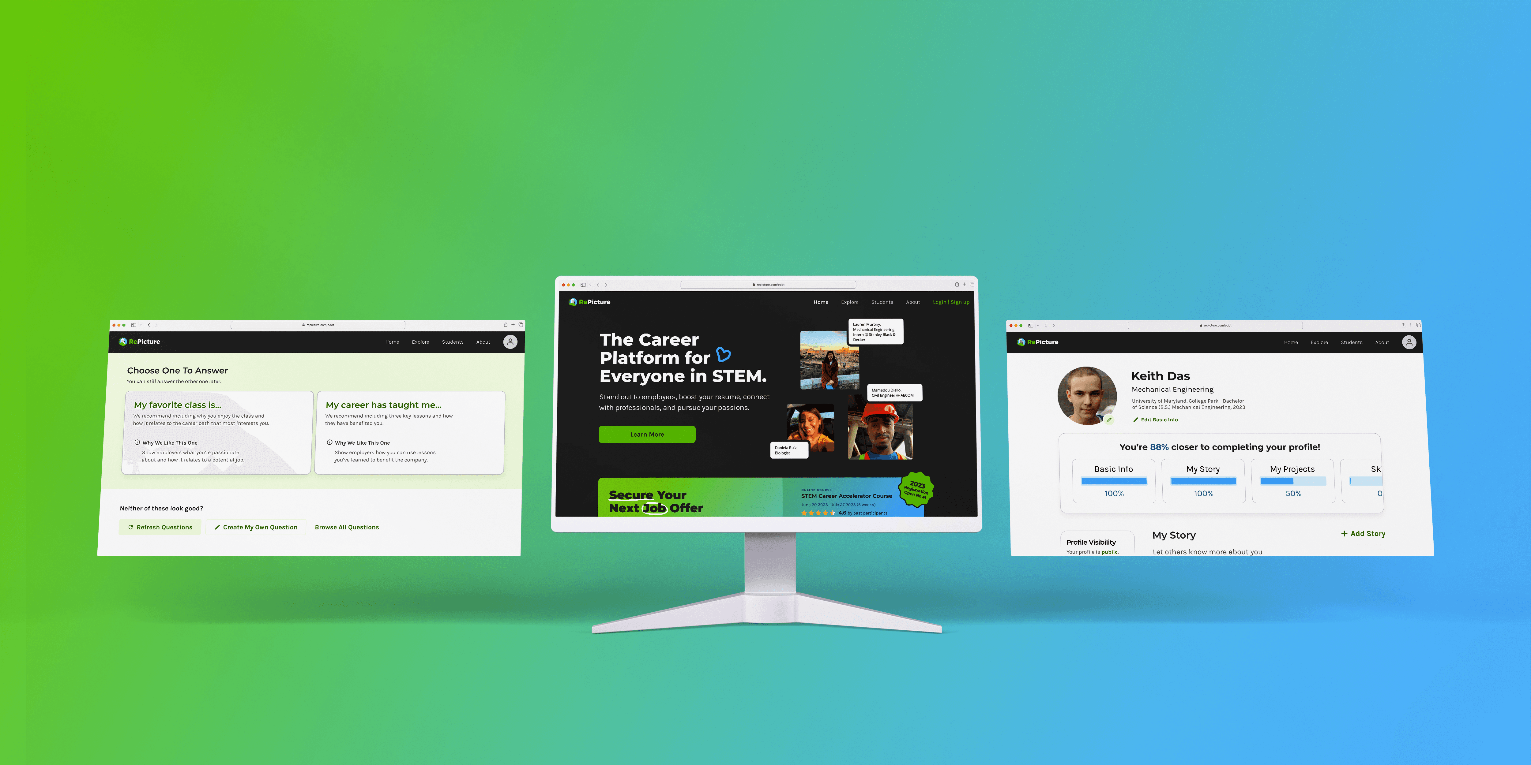
RePicture Redesign
Home page and web app redesign to increase customer acquisition and retention.
Client
RePicture is an online STEM community with a mission to increase diversity and interest in STEM through career development.
RePicture is an online STEM community focused on helping high school and college students launch their STEM career through professional development courses and a unique online profile page.

Before & After
I redesigned RePicture's home page & profile creation process.
I worked alongside a team of 4 other designers. My main contributions include designing the majority of the home page and the entire My Story flow.
View Live Site
Design Challenge
Not many people were signing up. When they did, they weren’t completing their profile or returning to use the platform.
Unclear What & Why
Website visitors didn't understand what RePicture was or how it could benefit them, so they weren't converted to create an account.
Complex Profile Creation
Users who do create an account and begin to fill out a profile often didn’t complete it. It was hard for users to know where to start, what to fill out, and if they were doing things right.
Business Goal
RePicture asked us to help increase the number of active college student users on the platform.
RePicture wanted to acquire and retain college students who create a profile and then continue to use it to its fullest potential. They approached our team of 5 Human Computer Interaction Masters Students to design a new UX and UI that improved the user journey from the discovery of the website to the completion of the profile.
My Contribution
I facilitated a team of 5 designers during one of three total design sprints, led client communication and presentation during another, and designed and researched across all three sprints.
Solution
My team and I redesigned the home page, focusing on a clearer “what” and “why,” and the profile creation process, focusing on a step-by-step, guided experience.
My Contribution
I designed the majority of the home page, and the entire My Story flow.
Outcomes
The redesign resulted in clearer communication, new endorsements & partners, and a more efficient product team.
Clearer Communication
100% (16/16) of prototype test participants felt the redesign communicated RePicture's "what" and "why" more clearly.
Additionally, according to RePicture's founders, the redesigned home page allowed RePicture communicate their mission, vision, and product offerings to a wide range of stakeholders more clearly, resulting in 3x more rapid acquisition of new partners and endorsements compared to previous years.
10 Government Endorsements & Funding from 7 New Corporate Partners
According to users, the home page looks and feels professional yet friendly. The designs have helped to build an identity centered around professionalism and trust, helping RePicture onboard new clients and corporate partners, according to RePicture's founders.
Since launch, 10 California State and Federal Congress People have endorsed RePicture, and RePicture has received thousands in funding from 7 corporate partners.
Design and Development Efficiency & Accessibility
The style guide and design system helped the engineering team to implement and ship the redesigns 150% faster than they otherwise would have, and have optimized the design and development of other recent design initiatives, like the Accelerator Page (I designed this page as well), according to RePicture's founders.
“The home page had a more open layout where everything was laid out individually, so it captured my attention more and made it easier to look through.”
— Survey Respondent
“This is an improvement on the current site, it’s more sleek and more put together”
— User Interview Participant
“[Compared to the current website, the redesign has a] simpler and easier process of creating the profile and adding all the information.”
— User Interview Participant


