SoundCloud UI Redesign
UI-focused redesign of SoundCloud's app to strengthen SoundCloud's visual language and better communicate SoundCloud's value to current and potential customers.
Client
SoundCloud is the world’s largest music and audio platform, offering the greatest selection of music from the most diverse creator community on earth.
Since launching in 2008, the platform has become renowned for its unique content and features, including the ability to share music and connect directly with artists, and the opportunity to unearth breakthrough tracks, raw demos, podcasts and more. This is made possible by an open platform that directly connects creators and their fans across the globe. Music and audio creators use SoundCloud to both share and monetize their content with a global audience, as well as receive detailed stats and feedback from the SoundCloud community.

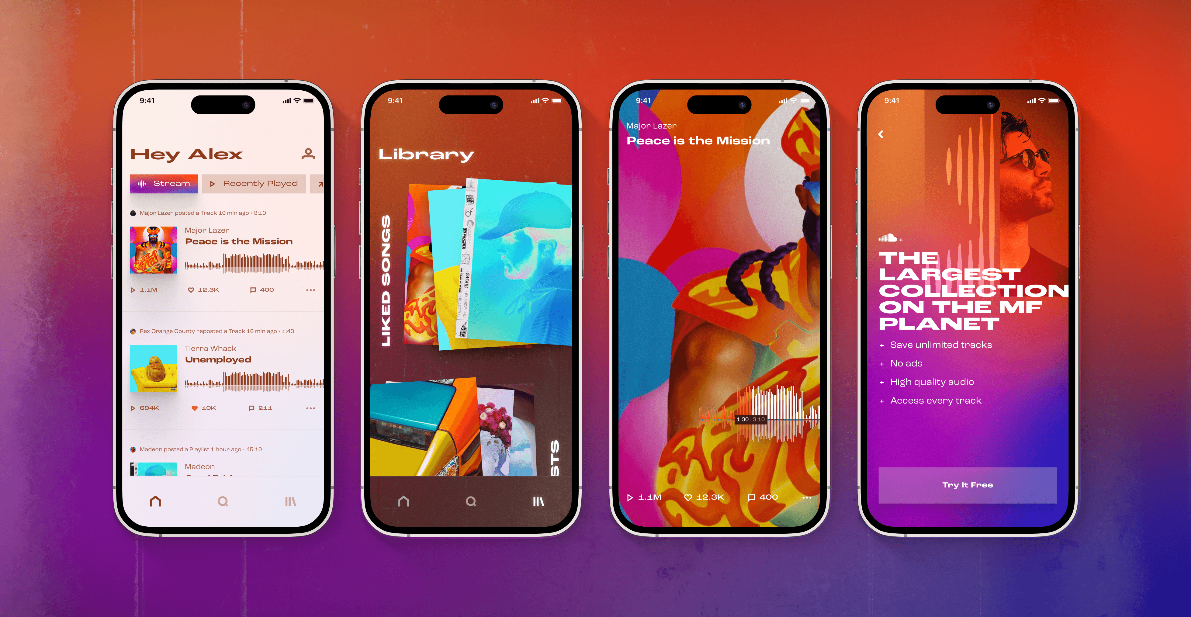
Before & After
I redesigned SoundCloud's mobile app, and designed a new TV interface.
I completed this speculative project as a part of my Masters in Human Computer Interaction.


Design Challenge
Despite having a unique point of view and a highly differentiated product in a saturated industry, SoundCloud’s visual design doesn't convey their strong brand.
Un-engaging & Unhelpful Interface
Where competitors’ search pages showcase their brand and provide filtering options for users, SoundCloud’s search page is bland and does not provide users with shortcuts. The library page is visually uninspiring and doesn't guide users toward the content they want as seamlessly.
Weak Brand Identity
Strong brand voices are evident on Spotify’s and Apple Music’s home pages, displayed through illustration, image, and layout style. SoundCloud relies only on the artist and album images, so the page lacks cohesion. The interface and iconography is blocky and generic.


Business Goals
Increase paid subscribers through better expression of the unique value that SoundCloud brings, a more premium, engaging experience, and stronger brand loyalty.
Increase brand awareness among users, especially as compared to competitors
This was a personal passion project intended to practice and demonstrate my visual design skills. I independently updated SoundCloud’s cross-platform visual strategy and language and implemented it across several digital and analogue executions, receiving critique from mentors and peers along the way. So these are hypothetical goals.
Solution
I independently designed and implemented a new design strategy and language that better expressed SoundCloud’s strong brand.


Outcomes
The redesign tied SoundCloud's visual design more closely to its strong brand.
Clearer Communication
Refocusing SoundCloud's visual language around it's strong brand by emphasizing direct connections between artists and fans, musical trendsetting, and limitless discovery through bold, edgy, colorful, textured, artist-centric designs helps to better communicate SoundCloud's unique position in the music streaming market.
This was a personal project to practice and demonstrate my visual design skills, but the business outcomes I'd measure are:
Paid Subscriber Growth, via…
User interviews, with the research goal of understanding if the redesign better conveys SoundCloud's unique value proposition to customers as compared to the current version
A/B testing and compare the number of conversions from free to paid accounts between the current and new designs
Brand awareness, via
Social listening over the short-term, and quarterly brand awareness surveys over the long-term.

